Anyone who works with optical coatings knows they can exhibit exceptionally attractive colors. These colors arise from interference effects that enhance reflectance or transmittance in specific parts of the visible spectrum while suppressing it in others. While colors occur in both transmitted and reflected light, the most vivid effects are usually observed in reflection. Optical coatings can be designed not only for specific spectral properties but also to achieve desired colors. This design process, however, is more complex due to the subjective nature of color.
Color, as experienced, is a human response to a luminous stimulus and varies between individuals. Since coatings are not luminous by themselves, a light source is required for their colors to be seen. To standardize color perception and remove subjectivity, theoretical standards are used, representing average responses and light sources. This allows the design goals for optical coatings to be expressed in unambiguous terms, though practical constraints, such as reflectance or transmittance levels and manufacturability, still influence achievable results.
1. Color Definition
Color is a subjective human response to the spectral composition of light. The human eye contains two types of receptors: cones and rods. Cones, located primarily in the retina’s center, are responsible for color perception, while rods respond to low-light levels. There are three types of cones, each sensitive to different parts of the spectrum, producing red, green, or blue sensations. While individual responses vary, about 95% of people agree on the perceived quality of specific colors, enabling the development of objective color definitions.
Color cannot be measured directly, so comparative measurements against agreed standards are used. These standards are typically based on three primary stimuli (red, green, and blue). By color matching, any color can be represented as a combination of these stimuli. The amounts of each primary stimulus required to reproduce a given color define the color coordinates, which are treated as independent measures due to the linearity of human color response.
Objective Color Measurement
Pure color responses derive from single spectral lines. If the color coordinates for all spectral lines are known, their combination yields the coordinates of the desired color. This concept forms the basis of objective color measurement. The color matching functions represent the relative amounts of primary stimuli required to reproduce the visible spectrum lines.
The CIE System
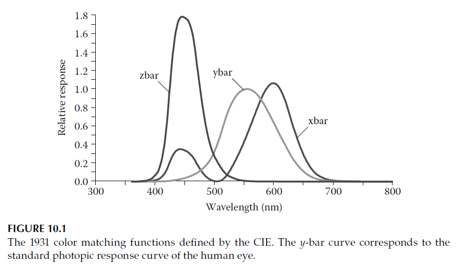
The Commission Internationale de l’Eclairage (CIE), established in 1913, defines internationally accepted standards for colorimetry. In 1931, the CIE introduced the Standard Observer, based on three color matching functions corresponding to primary stimuli labeled \(X\), \(Y\), and \(Z\) (roughly red, green, and blue). These stimuli, while unattainable in practice, are theoretical constructs ensuring all color matches use only positive values.
The \(y(\lambda)\) function was specifically defined to match the **human eye’s photopic response**, representing the spectral variation of perceived brightness. This alignment simplifies luminous property calculations for optical coatings. The color matching functions (\(x(\lambda)\), \(y(\lambda)\), and \(z(\lambda)\)) are shown in Figure 10.1.
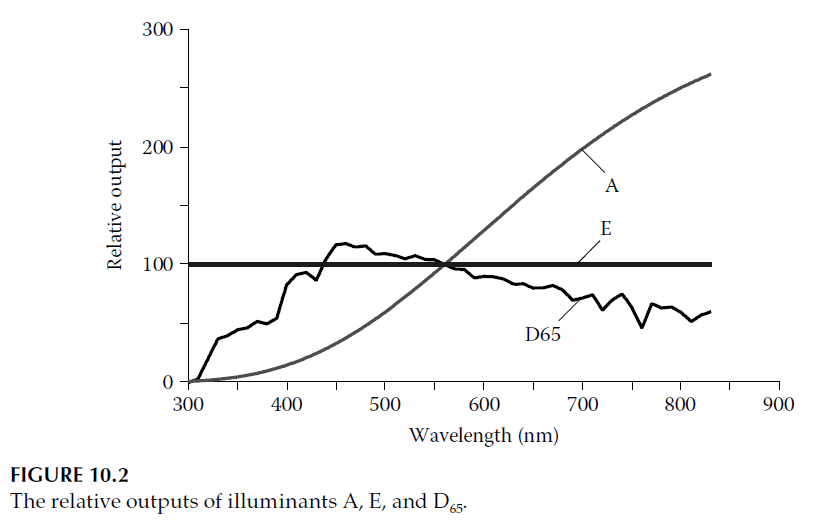
Illuminants and Sources
Since optical coatings require illumination to display color, the spectral properties of the light source are crucial. The CIE system defines illuminants (theoretical light distributions) and sources (practical implementations):
1. Illuminant A: Blackbody radiation at 2856 K, approximated by tungsten filament lamps.
2. Illuminant E: Equal-energy illumination, emitting constant power per wavelength across the visible spectrum.
3. Illuminant D65: Daylight representation (not direct sunlight) with a correlated color temperature of 6504 K.
The spectral distributions of these illuminants are shown in Figure 10.2, normalized to 100 at 560 nm.
Color Calculations
All color calculations begin with the **tristimulus values** (\(X, Y, Z\)):
\[
X = 100 \cdot \frac{\int S(\lambda) R(\lambda) x(\lambda) \, d\lambda}{\int S(\lambda) y(\lambda) \, d\lambda},
\quad Y = 100 \cdot \frac{\int S(\lambda) R(\lambda) y(\lambda) \, d\lambda}{\int S(\lambda) y(\lambda) \, d\lambda},
\quad Z = 100 \cdot \frac{\int S(\lambda) R(\lambda) z(\lambda) \, d\lambda}{\int S(\lambda) y(\lambda) \, d\lambda}.
\]
Here, \(S(\lambda)\) is the illuminant spectrum, and \(R(\lambda)\) is the coating’s response. \(Y\) represents the luminous reflectance or transmittance and is known as the luminance factor. To simplify visualization, the chromaticity coordinates (\(x, y\)) normalize these values:
\[
x = \frac{X}{X + Y + Z}, \quad y = \frac{Y}{X + Y + Z}.
\]
These coordinates define points on the chromaticity diagram.
Example: Decorative Coating
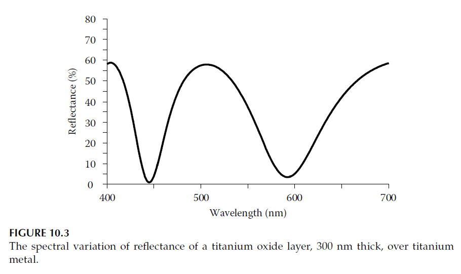
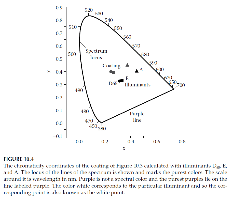
A simple decorative coating with a 300 nm titanium oxide layer on titanium foil shows a reflectance spectrum (Figure 10.3) that suggests a green color. The chromaticity coordinates calculated under illuminants A, E, and D65 (Figure 10.4) confirm this, indicating a shift toward the green spectrum locus.
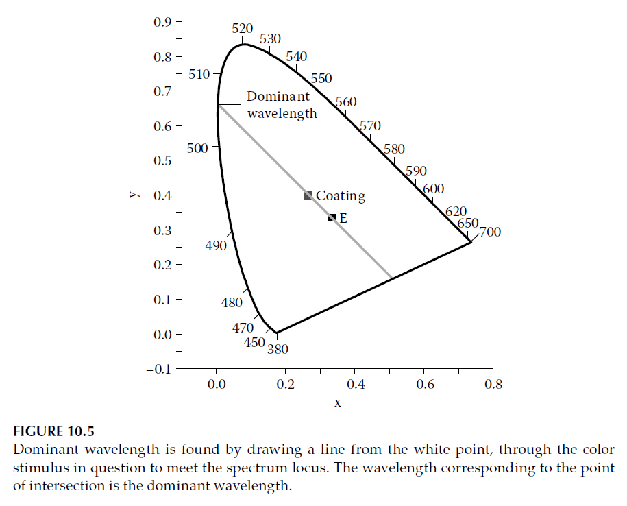
Color Properties: Purity and Dominant Wavelength
Color purity measures the proportion of white light mixed with spectral colors:
1. Colorimetric Purity: Based on the luminance fraction due to monochromatic stimuli.
2. Excitation Purity: Defined as the fractional distance from the white point to the spectrum locus.
Purity is calculated using:
\[
p_c = \frac{\sqrt{(x – x_w)^2 + (y – y_w)^2}}{\sqrt{(x_\lambda – x_w)^2 + (y_\lambda – y_w)^2}},
\]
where \((x_w, y_w)\) are the white point coordinates and \((x_\lambda, y_\lambda)\) are the spectrum line coordinates. For coatings with complementary wavelengths (e.g., purples), the calculations adapt by using the complementary point on the spectrum locus.
Conclusion
Optical coatings’ colors depend on their spectral responses and the chosen illuminant. Using tools like the CIE system and chromaticity diagrams, designers can achieve precise and reproducible colors tailored for specific applications. While dominant wavelength and purity provide valuable insights, they are typically used to enhance the understanding of color rather than as formal specifications.
2. The 1964 Supplementary Colorimetric Observer
Human color vision is a complex process involving both the brain and the eye. The perception of color depends not only on the spectral content of the light stimulus but also on the size of the retinal area being stimulated. This is often interpreted as the angular subtense of the stimulus area.
The 1931 Standard Observer, which forms the foundation of modern colorimetry, was based on experiments using fields that subtended 2° at the eye. These functions were validated for fields subtending between 1° and 4°, but larger fields began to show increasing deviations in color perception.
To account for these differences, the CIE (Commission Internationale de l’Eclairage) introduced the 1964 Supplementary Colorimetric Observer, which defines a new set of color matching functions for fields subtending 10° at the eye. These functions are denoted as:
\[
\overline{x}_{10}(\lambda), \quad \overline{y}_{10}(\lambda), \quad \overline{z}_{10}(\lambda)
\]
Key Characteristics of the Supplementary Observer
1. Angular Subtense: The supplementary observer is designed for larger fields (10°), addressing the limitations of the 1931 functions for broader visual fields.
2. Chromaticity Consistency: The equal energy stimulus remains normalized, with chromaticity coordinates of \(x = y = z = 1/3\).
3. Photopic Response: Unlike the 1931 Standard Observer, the \(\overline{y}_{10}(\lambda)\) function in the supplementary observer does not correspond to the photopic response function of the human eye.
Comparison of Observers
Figure 10.6 compares the color matching functions of the 1931 Standard Observer with those of the 1964 Supplementary Observer. The differences illustrate how the perception of color shifts with larger fields of view, making the 1964 functions more suitable for applications involving larger visual areas.
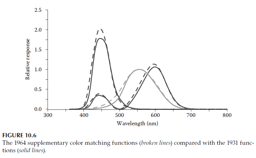
Applications
The 1964 Supplementary Observer is used in colorimetry when stimuli involve broader fields of view, such as in environmental lighting or large display systems. It complements the 1931 Standard Observer, which remains the standard for smaller visual fields.
3. Metamerism
By definition, tristimulus values allow for the possibility that color stimuli with entirely different radiant power distributions can produce identical color responses. Such stimuli are referred to as metamers, with the adjective being metameric and the phenomenon termed metamerism.
For non-self-luminous stimuli such as optical coatings, the spectral distribution of the source of illumination must also be considered. Since illumination varies between different types of light sources, two optical coatings that are metamers under one type of illumination may not appear identical under another. Only when the spectral responses of two coatings are identical will they exhibit the same color response under all illumination conditions. These perfect color matches are termed nonmetameric.
Importance of Metamerism in Coating Design
Metamerism plays a significant role in the design of optical coatings, particularly when achieving a specific color response is required:
1. Specified Illuminant: The illuminant under which the desired color response is to be observed must be clearly defined.
2. Color Matching: For pairs of coatings intended to always match in color qualities, their spectral responses must be equal, ensuring nonmetameric color matches across all lighting conditions.
4. Other Color Spaces
The X, Y, Z tristimulus values provide an unambiguous definition of color, and the derived chromaticity coordinates allow color information to be plotted in two dimensions. However, these plots do not directly correlate the distances between points to perceived color differences. This limitation leads to the concept of a uniform color space, where the linear distance between two points corresponds proportionally to the perceived color difference.
Although there is ongoing research in this area, two color spaces introduced by the CIE in 1976 significantly approach this concept of uniformity:
1. CIE (L*u*v*) Space (CIELUV)
2. CIE (L*a*b*) Space (CIELAB)
Both spaces are derived from the tristimulus values, but their expressions are more complex. In each space, colors are represented in a three-dimensional coordinate system, where the perceived color difference is proportional to the linear distance between points.
CIE (L*u*v*) Space (CIELUV)
In the CIE (L*u*v*) Space, the coordinates \(L^*\), \(u^*\), and \(v^*\) are defined as follows:
Luminance (\(L^*\)):
\[
L^* =
\begin{cases}
116 \cdot \left( \frac{Y}{Y_w} \right)^{1/3} – 16 & \text{if } \frac{Y}{Y_w} > 0.008856 \\
903 \cdot \frac{Y}{Y_w} & \text{if } \frac{Y}{Y_w} \leq 0.008856
\end{cases}
\]
Chromaticity Coordinates (\(u^*\) and \(v^*\)):
\[
u^* = 13 \cdot L^* \cdot (u’ – u_w’), \quad v^* = 13 \cdot L^* \cdot (v’ – v_w’)
\]
where:
\[
u’ = \frac{4X}{X + 15Y + 3Z}, \quad v’ = \frac{9Y}{X + 15Y + 3Z}
\]
The values \(u_w’\) and \(v_w’\) represent the chromaticity coordinates of the white point and are calculated using the tristimulus values of the reference white.
CIE (L*a*b*) Space (CIELAB)
The CIE (L*a*b*) Space uses a similar luminance definition (\(L^*\)) but different chromaticity coordinates (\(a^*\) and \(b^*\)):
Luminance (\(L^*\)):
\[
L^* =
\begin{cases}
116 \cdot \left( \frac{Y}{Y_w} \right)^{1/3} – 16 & \text{if } \frac{Y}{Y_w} > 0.008856 \\
903 \cdot \frac{Y}{Y_w} & \text{if } \frac{Y}{Y_w} \leq 0.008856
\end{cases}
\]
Chromaticity Coordinates (\(a^*\) and \(b^*\)):
\[
a^* = 500 \cdot \left[ f\left(\frac{X}{X_w}\right) – f\left(\frac{Y}{Y_w}\right) \right],
\quad b^* = 200 \cdot \left[ f\left(\frac{Y}{Y_w}\right) – f\left(\frac{Z}{Z_w}\right) \right]
\]
where:
\[
f(\phi) =
\begin{cases}
\phi^{1/3} & \text{if } \phi > 0.008856 \\
7.787 \cdot \phi + \frac{16}{116} & \text{if } \phi \leq 0.008856
\end{cases}
\]
Advantages and Limitations
Advantages:
– Both CIELUV and CIELAB spaces closely correlate perceived color differences with linear distances in their respective coordinate systems.
– These spaces are frequently used for the specification of required colors in design and manufacturing.
Limitations:
– Because \(u^*\) and \(v^*\) (in CIELUV) and \(a^*\) and \(b^*\) (in CIELAB) depend on \(L^*\), two-dimensional plots (\(u^*\) vs. \(v^*\) or \(a^*\) vs. \(b^*\)) do not provide unique chromaticity coordinates.
– This limitation means that while these spaces improve color difference calculations, they do not diminish the importance of the traditional **chromaticity diagram** for visualizing color relationships.
5. Hue and Chroma
The terms hue and chroma are fundamental in describing color:
– Hue refers to what we commonly think of as “color.” Examples include red, green, yellow, blue, and purple.
– Chroma is akin to “purity,” describing how closely the color response resembles that of a monochromatic light stimulus.
These terms are prominently used in the Munsell Color System, which represents color using a cylindrical coordinate model. The system identifies three attributes of any color:
1. Chroma: The radial distance from the cylinder’s axis, indicating the purity of the color.
2. Hue: The angle around the cylinder’s circumference, corresponding to the type of color (e.g., red, yellow, blue).
3. Value: The vertical position along the cylinder’s axis, representing the color’s lightness.
In the Munsell system, the figure is not a perfect cylinder, but the coordinates follow the described relationships.
CIE Correlates of Lightness, Chroma, and Hue
Recognizing the utility of such coordinates, the CIE adapted similar concepts into the 1976 (L*u*v*) Space (CIELUV) and 1976 (L*a*b*) Space (CIELAB). These spaces include correlates for lightness, chroma, and hue:
Lightness Correlate
\[
L^* \text{ is the correlate of lightness.}
\]
Chroma Correlates
For CIELUV:
\[
C_{uv}^* = \sqrt{(u^*)^2 + (\nu^*)^2}
\]
For CIELAB:
\[
C_{ab}^* = \sqrt{(a^*)^2 + (b^*)^2}
\]
Hue Correlate
The hue correlate is defined as an angle in degrees, indicating the hue’s position around the color space:
For CIELUV:
\[
h_{uv} = \arctan\left(\frac{\nu^*}{u^*}\right)
\]
For CIELAB:
\[
h_{ab} = \arctan\left(\frac{b^*}{a^*}\right)
\]
In these calculations, the signs of \(u^*\), \(\nu^*\), \(a^*\), and \(b^*\) are preserved to unambiguously determine the quadrant of the angle.
Note on Munsell System and CIE Coordinates
While the CIE chroma and hue correlates share conceptual similarities with the Munsell system, they are not direct conversions. The CIE coordinates simply represent cylindrical coordinates in the CIELUV or CIELAB spaces, while the Munsell system uses its own specific methodology for color representation.
6. Brightness and Optimal Stimuli
Decorative coatings modify the spectral quality of light to create specific color sensations. Although not universal, most decorative coatings are designed for reflection. For simplicity, we will assume reflection in this discussion, but the conclusions apply equally to transmitting coatings.
Brightness and Luminance Factor
Color purity is a straightforward concept that refers to how closely a color resembles a monochromatic stimulus. Brightness, however, is more subjective and describes the intensity of a stimulus—how much light it emits or reflects compared to another. Brighter stimuli are perceived as more intense.
Our perception of brightness approximately follows a 1/3 power law, which is why this relationship is embedded in the definitions of the L*a*b* and L*u*v* color spaces. For the purposes of this section, brightness is quantified by the luminance factor, represented by the \(Y\) tristimulus value. A larger \(Y\) corresponds to greater brightness.
Color-Brightness Relationship
Consider a decorative coating that appears completely white with a luminance factor of 100. If we gradually narrow the spectral bandwidth of the reflected light, the color of the coating becomes purer, approaching a single spectral element. However, this increase in color purity comes at the expense of reduced brightness, as less light is reflected. This illustrates the inherent relationship between color purity and brightness.
Optimal Color Stimuli
An optimal color stimulus exhibits the highest possible luminance factor for a given set of chromaticity coordinates. Such stimuli have a perfectly rectangular spectral response:
– Uniformly 100% reflectance between two edge wavelengths, with zero reflectance outside.
– Alternatively, zero reflectance within a band and uniformly 100% reflectance outside.
This idealized response maximizes luminance for a specific chromaticity. The locus of optimal stimuli can be calculated and plotted on the chromaticity diagram for a given luminance factor. These loci depend on the illuminant, and examples are tabulated in references such as Wyszecki and Styles. Figure 10.7 illustrates loci calculated for the D65 illuminant.
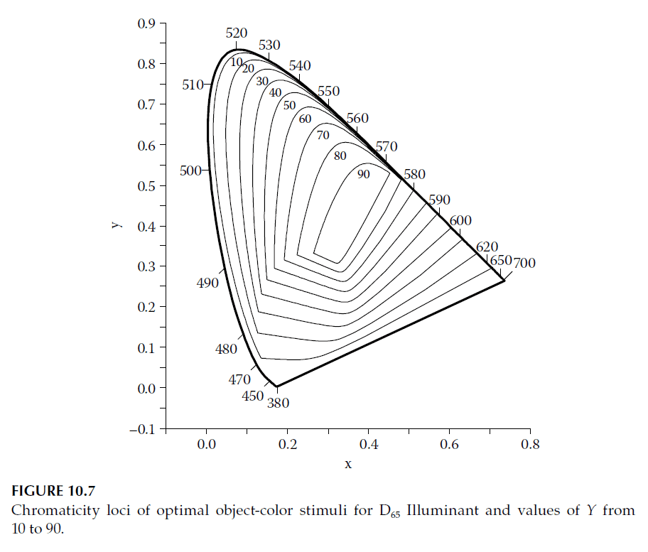
Practical Application
Knowing the maximum possible luminance factor for a given chromaticity allows for an objective assessment of coating quality. Designers can compare the performance of a coating with the theoretical maximum, avoiding unrealistic design goals.
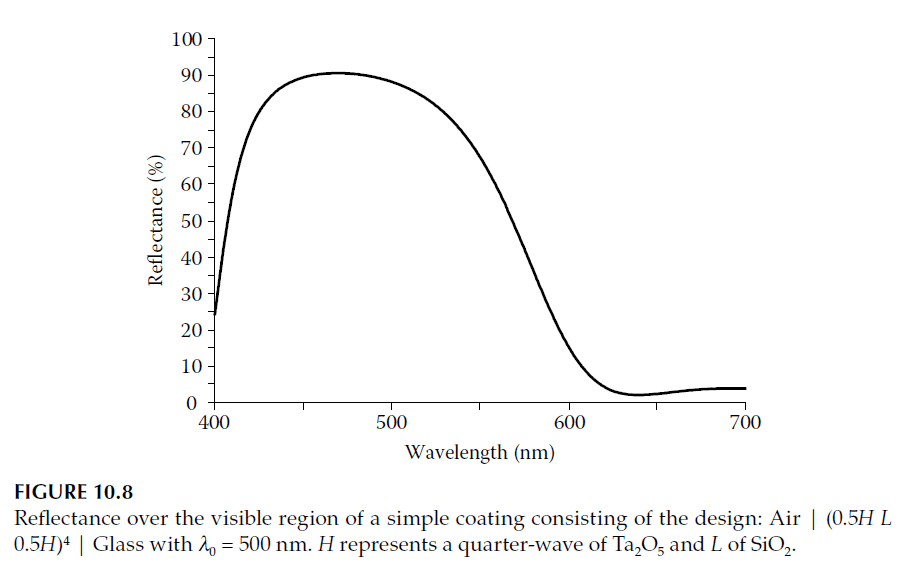
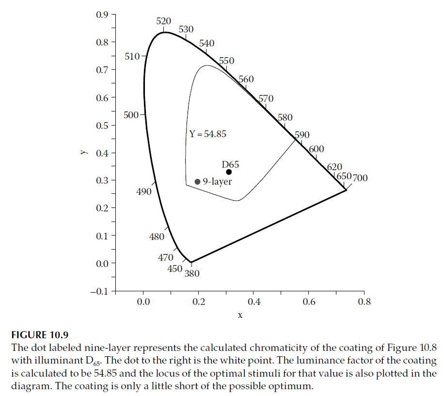
Example Assessment
Let us evaluate the performance of a simple nine-layer optical coating (design listed in the caption of Figure 10.8):
1. Chromaticity coordinates for the coating are calculated under the D65 illuminant and 1931 Standard Observer and plotted in Figure 10.9.
2. The luminance factor \(Y\) is found to be 54.85.
3. The locus of the optimal stimuli corresponding to this luminance factor is plotted on the chromaticity diagram.
The coating does not achieve full optimization due to its 90% reflectance, falling short of the ideal 100% reflectance. However, the gap between the coating’s performance and the theoretical optimum is small. This analysis demonstrates how knowledge of the optimum luminance factor aids in setting realistic design targets for decorative optical coatings.
7. Colored Fringes
Colored fringes are often observed in simple film systems, such as oil on water or protective lacquer over metal. These fringes, localized within the film, are easy to see and are sometimes referred to as Newton’s rings, named after Isaac Newton, who conducted detailed studies of such phenomena in his Optiks. The appearance of these fringes strongly depends on the viewing conditions and the source of illumination.
Coherence and Coherence Length
The concept of coherence was introduced earlier, along with coherence length, which quantifies the extent to which interference effects are sustained. Coherence length can be defined as the path difference beyond which interference effects disappear. While the exact point at which interference vanishes is debatable, a widely used expression for coherence length is:
\[
\text{Coherence Length} = \frac{\lambda^2}{\Delta \lambda}
\]
Here, \( \Delta \lambda \) is the spectral bandwidth of the system, which may be determined by the light source, receiver, or intervening components. Fringes in a film disappear when the double traversal of the film exceeds the coherence length.
Broadband Illumination and Fringes
With broadband illumination, such as daylight, the spectral bandwidth is large. In this case, the limiting bandwidth is determined by the spectral response of the cones in the retina, which is approximately 100 nm. For instance:
– At a wavelength of \( \lambda = 550 \, \text{nm} \):
\[
\text{Coherence Length} = \frac{\lambda^2}{\Delta \lambda} = \frac{550^2}{100} \approx 3.025 \, \mu \text{m}
\]
This implies that the limiting optical thickness of the film is slightly greater than 1.5 μm.
However, different light sources yield different coherence lengths:
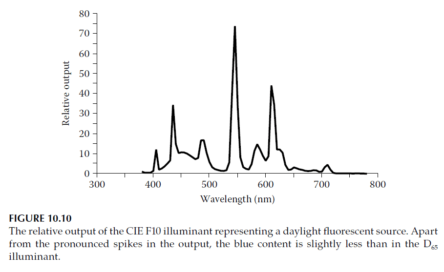
– Fluorescent lights, which are based on mercury discharge, produce output spectra with strong narrow spectral lines. For example, a daylight fluorescent source (CIE F10 illuminant) exhibits spectral spikes approximately 10 nm wide, resulting in a coherence length of:
\[
\text{Coherence Length} = \frac{550^2}{10} \approx 30 \, \mu \text{m}
\]
This coherence length dominates over the human eye’s limitation, allowing fringes to be observed in films up to approximately 15 μm in optical thickness.
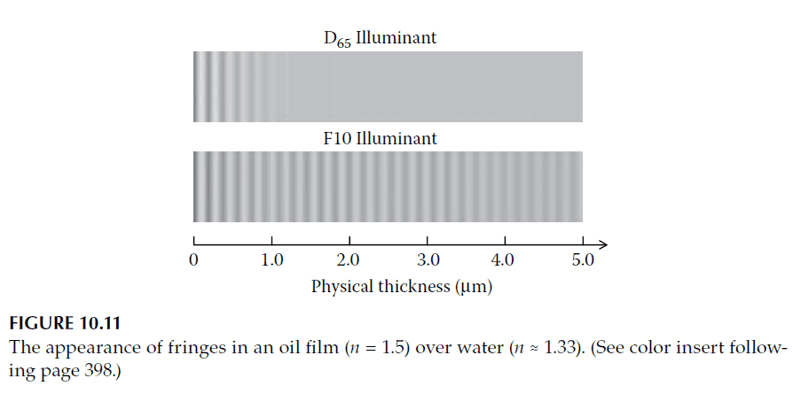
Illustrative Example
Consider oil with a refractive index of \( n = 1.5 \) over water with \( n \approx 1.33 \). Assume the physical thickness of the oil varies from 0 to 5 μm. Using the 1931 Standard Observer, we can calculate the appearance of fringes under:
1. D65 illuminant (daylight)
2. F10 illuminant (fluorescent light)
Results:
– Under D65 illumination, fringes disappear at a physical thickness of 1 μm, corresponding to an optical thickness of \( 1.5 \, \mu \text{m} \), as predicted.
– Under F10 illumination, fringes remain visible up to a physical thickness of 5 μm, corresponding to an optical thickness of \( 7.5 \, \mu \text{m} \).
Figure 10.11 illustrates this comparison, highlighting the extended visibility of fringes under the F10 illuminant.
Practical Observations
This effect is often noticeable in decorative metal objects protected by transparent lacquer, such as door handles and faucets. The interplay between the film thickness, refractive indices, and illumination conditions creates the characteristic colored fringes.